
Idea
The assignment presents the challenge to design new orientation signs for WC pictograms for both women and men. Since this workshop includes Indonesian as well as German students, the final design should be understandable right away for both cultures.
The basic idea of creating pictograms is to visually communicate a message in a clear and easy way without using words. Especially with our different backgrounds, we are also creating an Indonesian-German culture center.
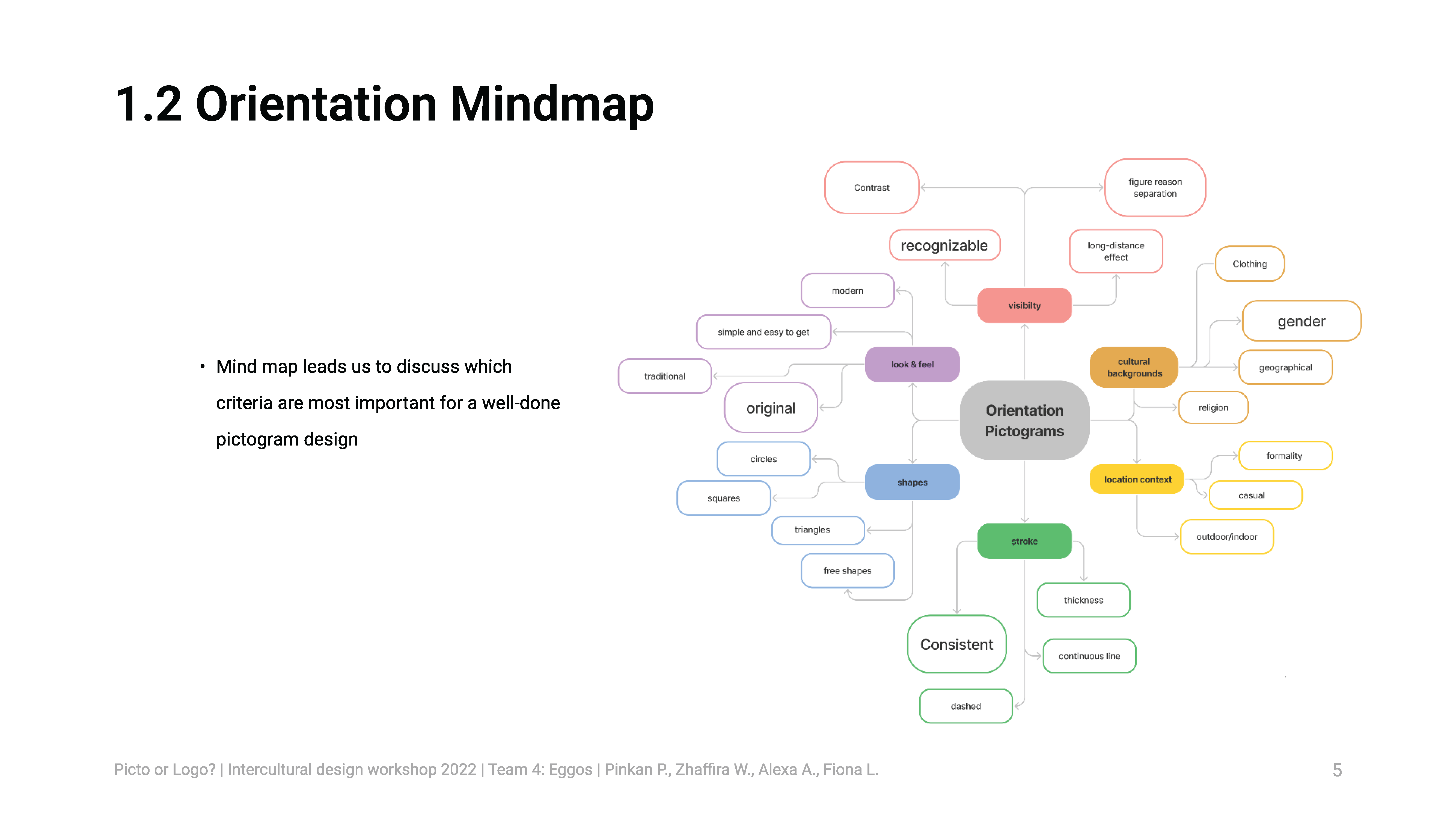
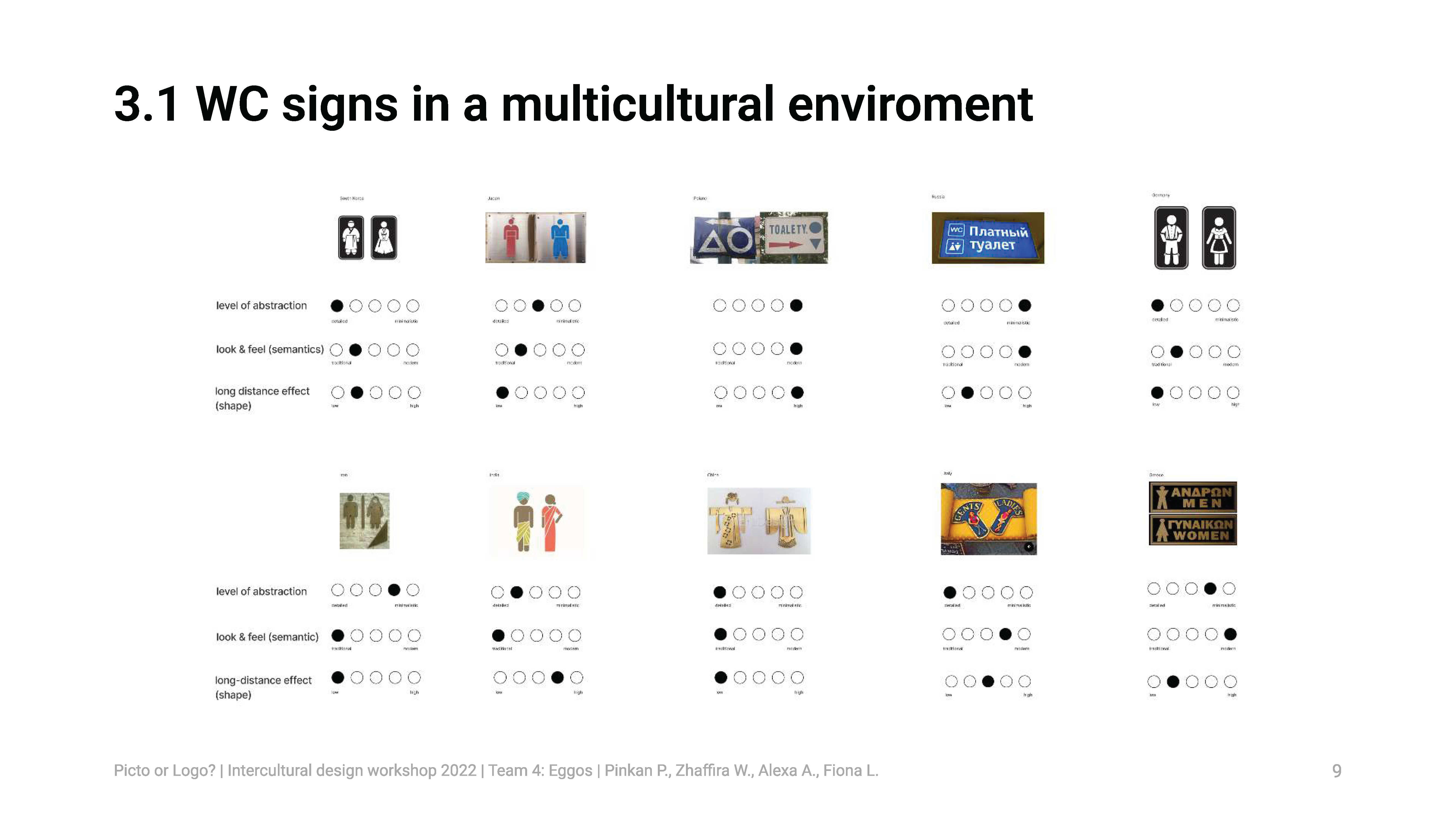
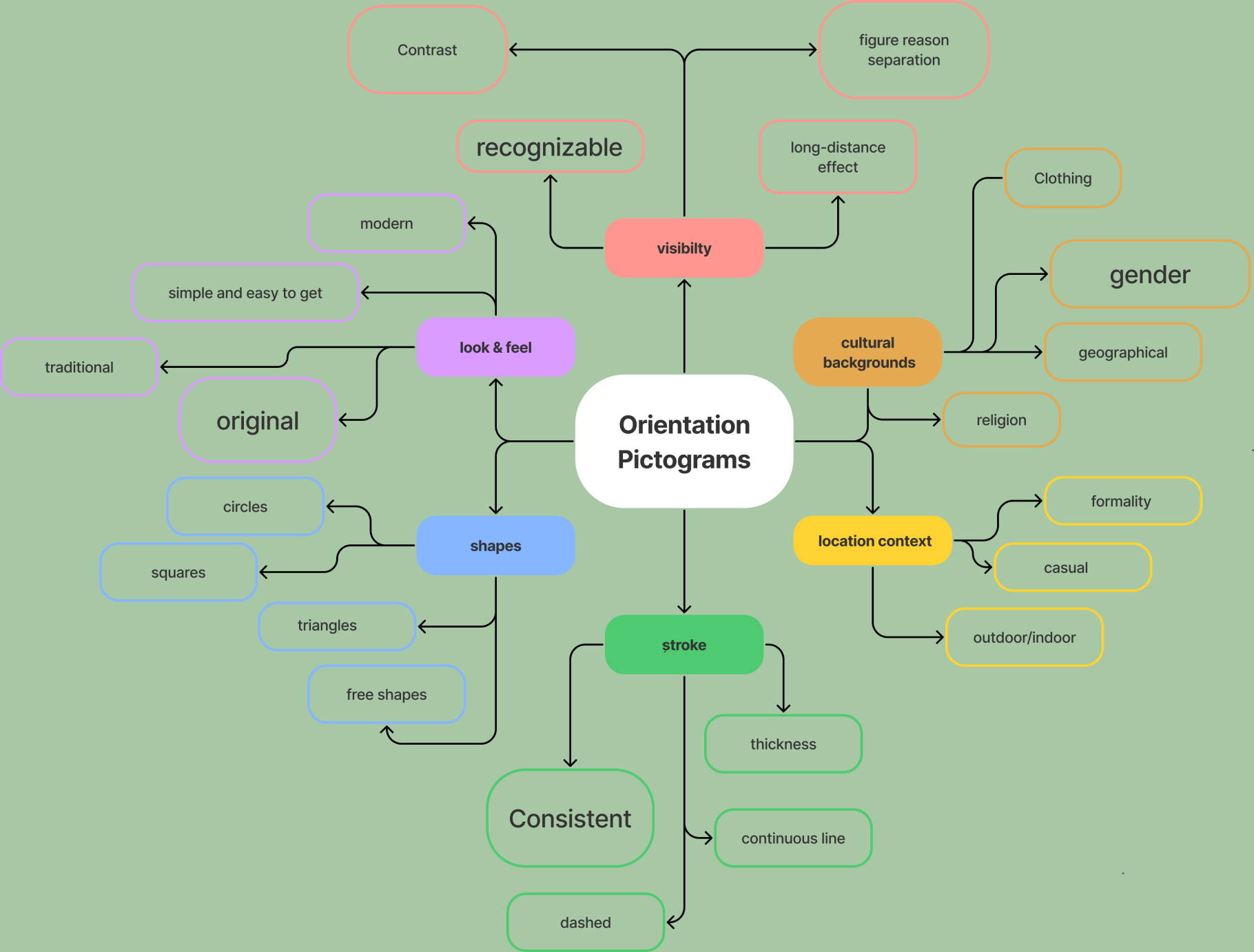
As a first step, mind maps led us to discuss which criteria are most important for a well done pictogram design. After analyzing various WC Signs from Asia and Europe, we learned how difficult it can be for foreigners to understand signs, which were in need of background knowledge. Therefore, it is very important to keep those signs simple.
Our pictogram designs are based on the criteria and keywords our team/group analyzed during our research and brainstorming.
Research
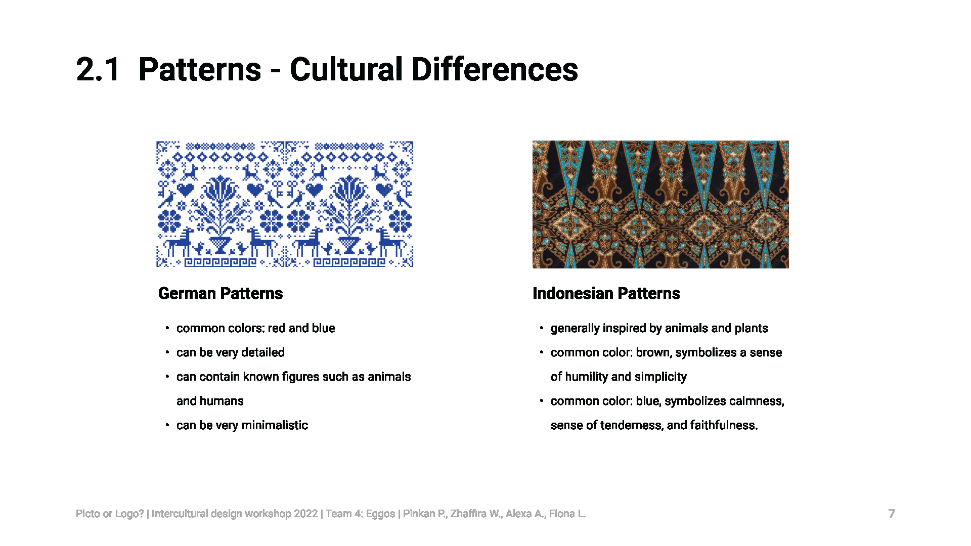
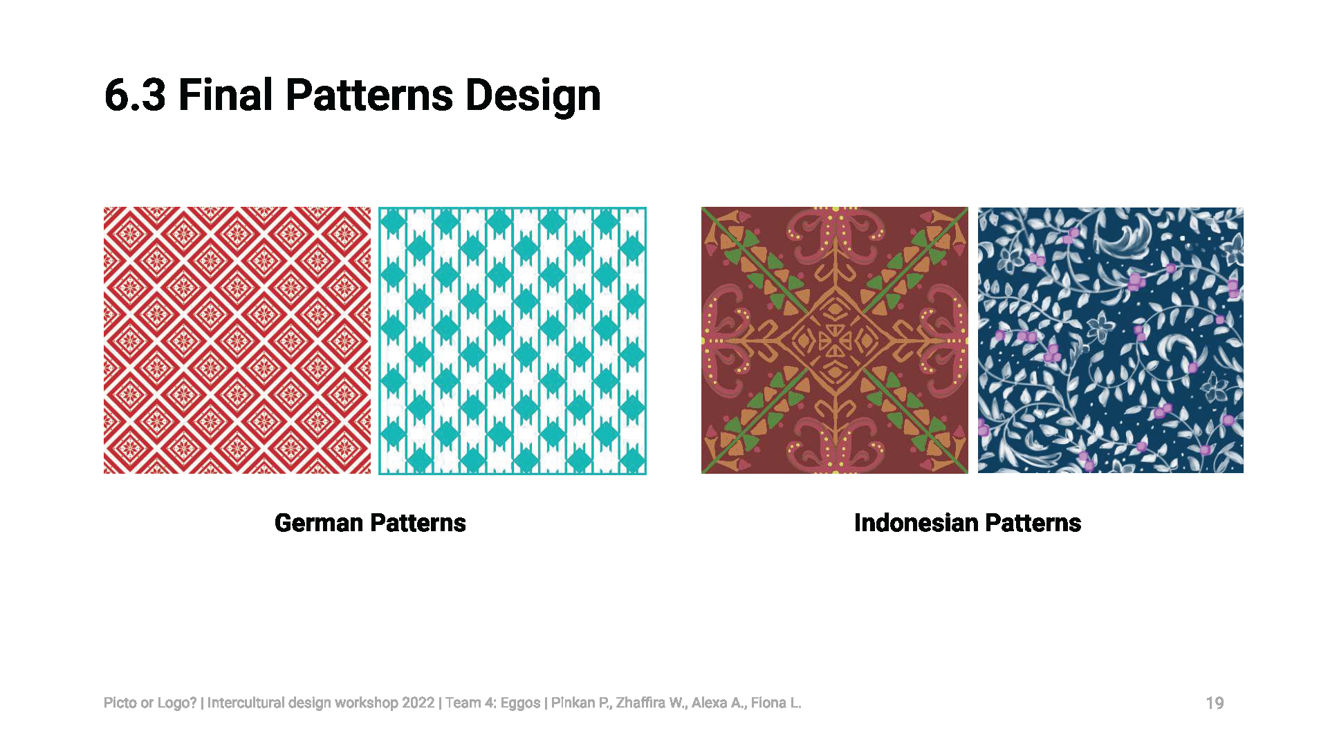
To integrate both our cultures in our final design, we wanted to use common Indonesian and German patterns as a background for our minimalistic pictograms.
German traditional patterns were mostly used for embroidery and such, therefore they can look like pixel art. Common colors are red and blue. They can be very detailed and often contain known figures such as animals and humans. They also can be very minimalistic with basic shapes and forms.
Indonesia has many varieties of traditional fabrics such as batik. Batik patterns and philosophy vary depending on the region of origin. Generally, batik uses motifs inspired by animals and plants. Most batik uses brown colors in its pattern which symbolizes a sense of humility and simplicity, but can vary depending on the type of batik. Blue is also a color commonly used in batik. It symbolizes calmness, also invokes a sense of tenderness, heartiness and faithfulness.
Intercultural Perspective
The intercultural perspective is an important aspect of designing pictograms for orientation signs in a multicultural environment such as WC signs in an airport.
The usage of restrooms is a basic need for everyone, therefore these signs should not only be understandable and inclusive for local people but also for foreigners who are coming to other countries for a variety of reasons. Intercultural communication is a must in a globally connected world, that is why details, that can be interpreted by one specific culture only, should not be included in the design.
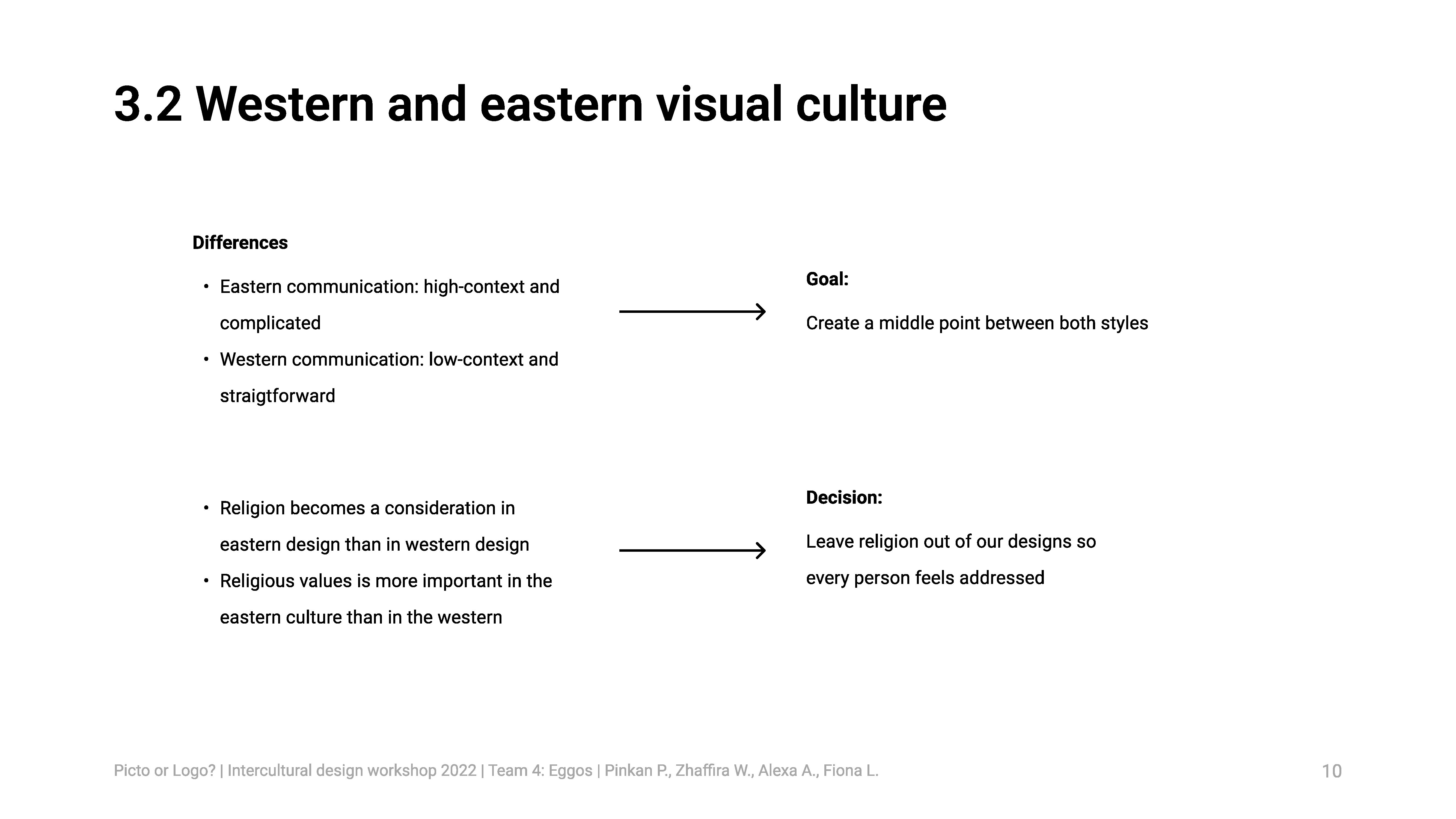
We also noticed the differences between Eastern and Western visual culture from our research.
In design, Eastern communication is more high-context, while Western communication is rather low-context, so we tried to combine these aspects to create a middle point between both styles.
Religion is a more important aspect in the Eastern culture than in the Western world. Because of that, we decided to leave this element out of our designs to let every person feel addressed and not left out.
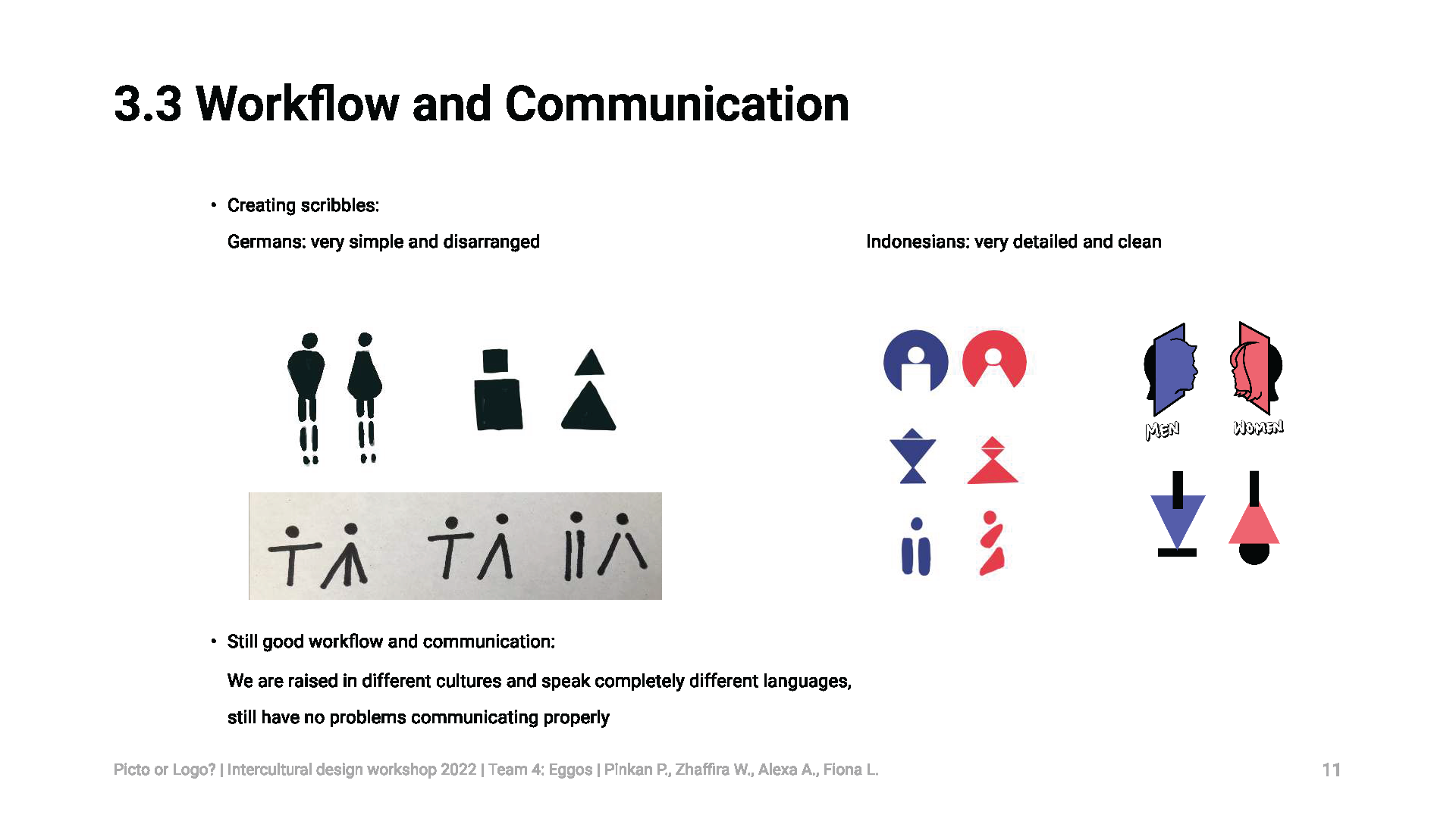
The approach to develop the first ideas for the designs were different when comparing Germans and Indonesians. Germans started to make very simple and disarranged scribbles to somehow get the first ideas on paper while Indonesians presented their first ideas very detailed and clean. Still we found a good balance to work further on our common goal.
Regarding the communication aspect, there is only to say that even if we are from various continents, raised in different cultures and speak completely different languages like Javanese, German, Russian, Hungarian and Italian, we still had no problems communicating effectively. This may be mostly because of the internet and because our generation has grown-up in a globalized world.
Message
Pictograms convey messages through symbols and shapes in a very obvious manner so that every person will get the message right away.
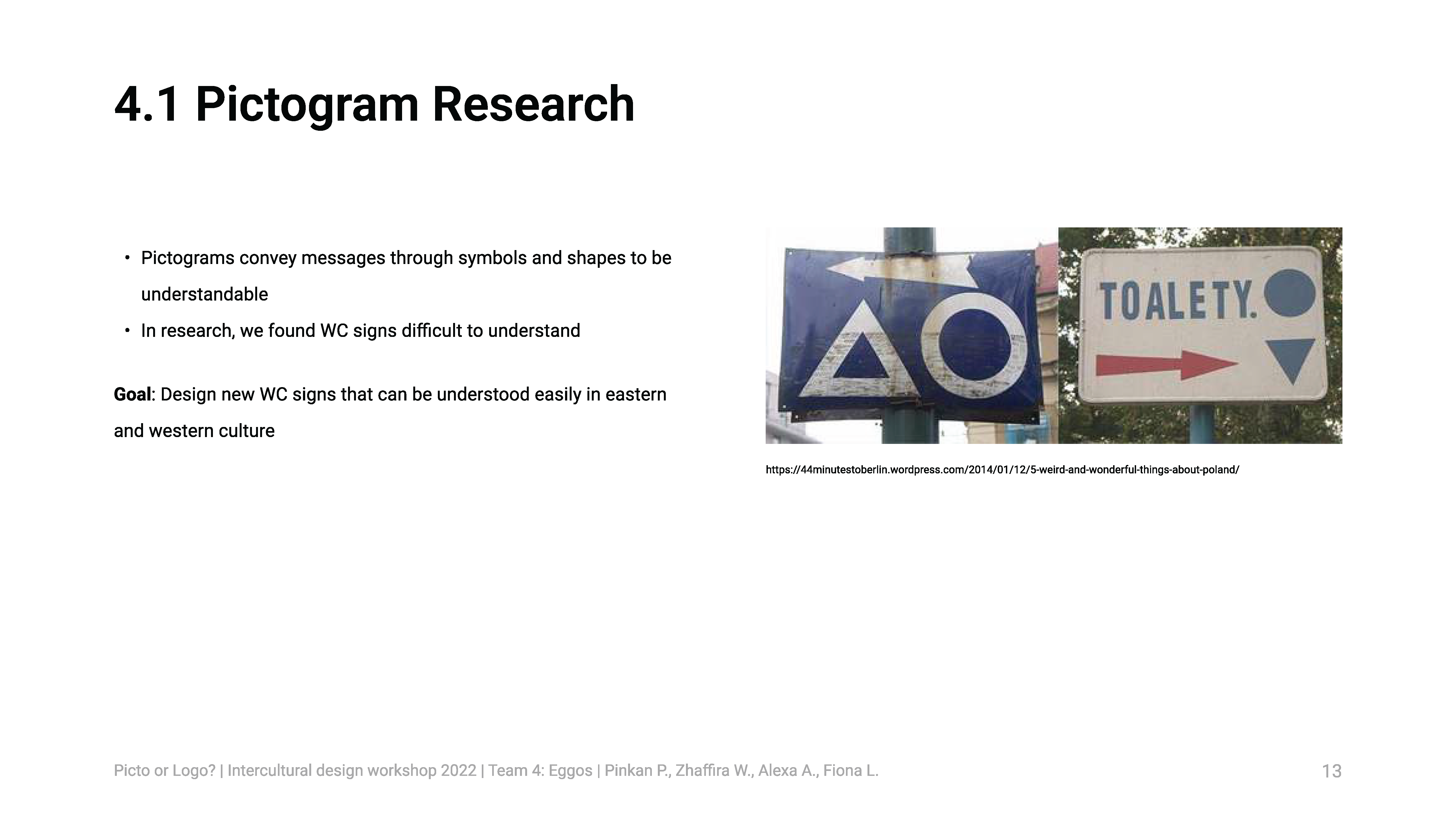
In our pictogram research, we found WC signs that we find difficult to understand, so in this workshop, we designed new WC signs that can be understood by everyone from both eastern and western cultures.
Concept
We defined three criteria in designing our WC sign: modern, playful, and abstract.
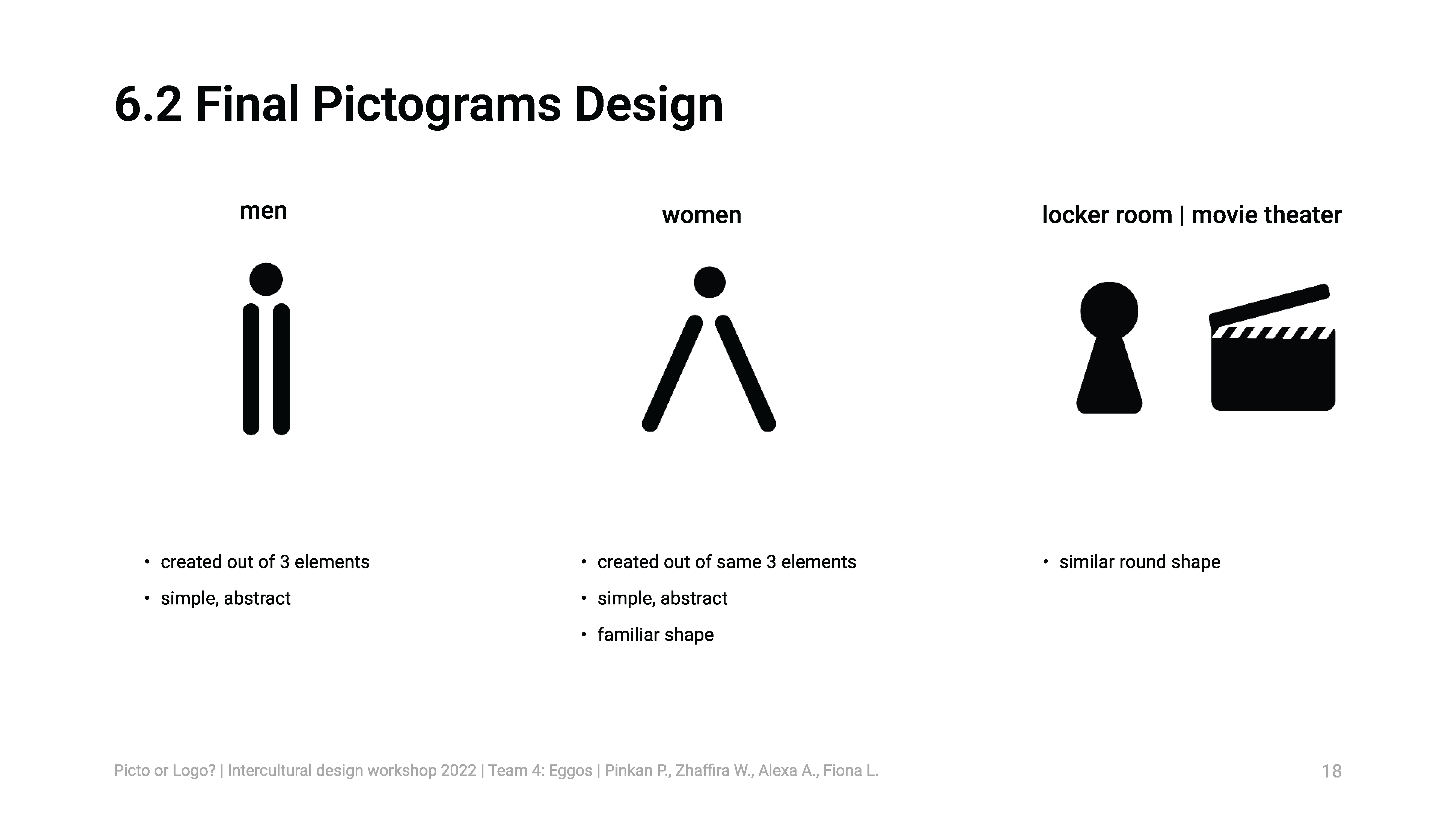
We are creating a WC sign that is more simplistic and has a minimalistic aspect into it. With simple shapes, the message that the sign wants to convey will be delivered more quickly to the audience. Even though our main goal is to design intercultural WC signs, we still want to bring something from our cultures into the concept.
Design
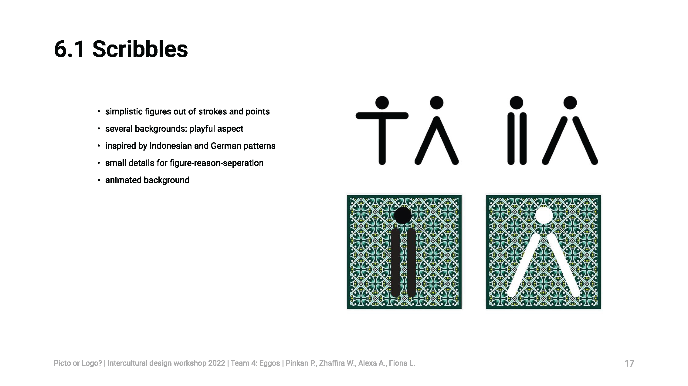
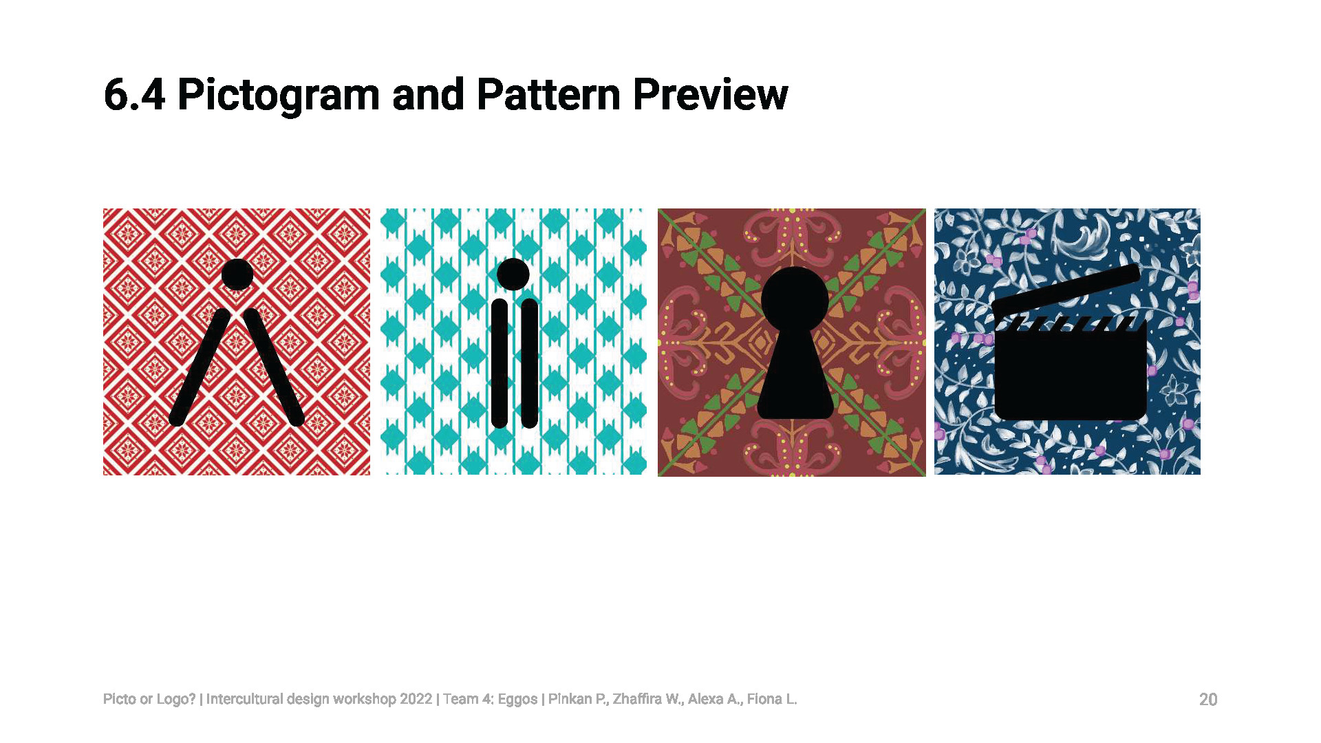
For the design, we created simplistic figures out of strokes and points that will represent women on the one side and men on the other. As the abstract criteria from our concept is implemented, the playful side also has to be made. For that we designed several backgrounds that are inspired by Indonesian and German patterns that are going to represent both of our cultures.
These patterns should also have small details to make the figure-ground separation work. Otherwise the figures would melt into the background. The background is going to be animated to make it more dynamic and also to present all patterns.
Conclusion
In conclusion, the assignment for us was a very new experience that we are happy to be part of. In this short time, we learned a lot about intercultural communication that we were even able to implement in our own ideas for the design.
Our group dynamic was very good and it was easy to work together. We learned a lot from each other, from culture, religion and other differences to similarities and things we have in common.

